一、CSS3 简介 1.CSS3 概述
CSS3 是CSS2 的升级版本,它在CSS2 的基础上,新增了很多强大的新功能,从而解决一些实际
面临的问题。
CSS3 在未来会按照模块化的方式去发展: https://www.w3.org/Style/CSS/current-work.html
CSS3 的新特性如下:
新增了更加实用的选择器,例如:动态伪类选择器、目标伪类选择器、伪元素选择器等等。
新增了更好的视觉效果,例如:圆角、阴影、渐变等。
新增了丰富的背景效果,例如:支持多个背景图片,同时新增了若干个背景相关的属性。
新增了全新的布局方案 —— 弹性盒子。
新增了Web 字体,可以显示用户电脑上没有安装的字体。
增强了颜色,例如: HSL 、HSLA 、RGBA 几种新的颜色模式,新增 opacity 属性来控制透明度。
增加了2D 和3D 变换,例如:旋转、扭曲、缩放、位移等。
增加动画与过渡效果,让效果的变换更具流线性、平滑性。
……
2.CSS3私有前缀 2.1 什么是私有前缀 如下代码中的-webkit- 就是私有前缀
1
2
3
4
5
div { width : 400px ; height : 400px ; -webkit-border-radius : 20px ; }
2.2 为什么要有私有前缀
2.3 常见浏览器私有前缀
Chrome 浏览器: -webkit-
Safari 浏览器: -webkit-
Firefox 浏览器: -moz-
Edge 浏览器: -webkit-
旧 Opera 浏览器: -o-
旧 IE 浏览器: -ms-
注意:
我们在编码时,不用过于关注浏览器私有前缀,不用绞尽脑汁的去记忆,也不用每个都去查询,因为常用的CSS3
二、CSS3 基本语法 1.CSS3 新增长度单位
rem 根元素字体大小的倍数,只与根元素字体大小有关。
vw 视口宽度的百分之多少 10vw 就是视口宽度的10% 。
vh 视口高度的百分之多少 10vh 就是视口高度的10% 。
vmax 视口宽高中大的那个的百分之多少。(了解即可)
vmin 视口宽高中小的那个的百分之多少。(了解即可)
新增长度单位.html
1 2 3 4 5 6 7 8 9 10 11 12 13 14 15 16 17 18 19 20 21 22 23 24 25 26 27 28 29 30 31 32 33 34 35 36 <!DOCTYPE html > <html lang ="zh-CN" > <head > <meta charset ="UTF-8" > <title > 新增长度单位</title > <style > * { margin : 0 ; padding : 0 ; } .box1 { width : 200px ; height : 200px ; background-color : deepskyblue; } .box2 { width : 20vw ; height : 20vh ; background-color : green; } .box3 { width : 20vmax ; height : 20vmin ; background-color : orange; } </style > </head > <body > <div class ="box1" > 像素</div > <div class ="box2" > vw和vh</div > <div class ="box3" > vmax</div > </body > </html >
2.CSS3 新增颜色设置方式 CSS3 新增了三种颜色设置方式,分别是: rgba 、hsl 、hsla ,由于之前已经详细讲解,此处略过。
3.CSS3 新增选择器 CSS3 新增的选择器有:动态伪类、目标伪类、语言伪类、UI 伪类、结构伪类、否定伪类、伪元素;这些在CSS2 中已经详细讲解,此处略过。
4.CSS3 新增盒模型相关属性 4.1. box-sizing 怪异盒模型 使用box-sizing 属性可以设置盒模型的两种类型
可选值
含义
content-box
width 和 height 设置的是盒子内容区的大小。(默认值)
border-box
width 和 height 设置的是盒子总大小。(怪异盒模型)
box-sizing.html
1 2 3 4 5 6 7 8 9 10 11 12 13 14 15 16 17 18 19 20 21 22 23 24 25 26 27 28 29 30 <!DOCTYPE html > <html lang ="zh-CN" > <head > <meta charset ="UTF-8" > <title > 01_box-sizing</title > <style > .box1 { width : 200px ; height : 200px ; background-color : deepskyblue; padding : 5px ; border : 5px solid black; margin-bottom : 20px ; } .box2 { width : 200px ; height : 200px ; background-color : gray; padding : 5px ; border : 5px solid black; box-sizing : border-box; } </style > </head > <body > <div class ="box1" > </div > <div class ="box2" > </div > </body > </html >
4.2. resize 调整盒子大小 使用resize 属性可以控制是否允许用户调节元素尺寸。
值
含义
none
不允许用户调整元素大小。 (默认)
both
用户可以调节元素的宽度和高度。
horizontal
用户可以调节元素的宽度 。
vertical
用户可以调节元素的高度。
resize.html
1 2 3 4 5 6 7 8 9 10 11 12 13 14 15 16 17 18 19 20 21 22 23 24 25 26 27 <!DOCTYPE html > <html lang ="zh-CN" > <head > <meta charset ="UTF-8" > <title > 02_resize</title > <style > .box1 { width : 400px ; height : 400px ; background-color : orange; resize : both; overflow : scroll; } .box2 { width : 800px ; height : 600px ; background-color : skyblue; } </style > </head > <body > <div class ="box1" > <div class ="box2" > 123</div > </div > </body > </html >
4.3. box-shadow 盒子阴影 使用 box-shadow 属性为盒子添加阴影。
box-shadow.html
1 2 3 4 5 6 7 8 9 10 11 12 13 14 15 16 17 18 19 20 21 22 23 24 25 26 27 28 29 30 31 32 33 34 35 36 37 38 39 40 41 42 43 44 45 46 47 48 49 <!DOCTYPE html > <html lang ="zh-CN" > <head > <meta charset ="UTF-8" > <title > 03_box-shadow</title > <style > .box1 { width : 400px ; height : 400px ; background-color : orange; margin : 0 auto; margin-top : 100px ; font-size : 40px ; position : relative; top : 0 ; left : 0 ; transition : 0.4s linear all; } .box1 :hover { box-shadow : 0px 0px 20px black; top : -1px ; left : 0 ; } </style > </head > <body > <div class ="box1" > 你好啊</div > </body > </html >
4.4. opacity 不透明度 opacity 属性能为整个元素添加透明效果, 值是 0 到 1 之间的小数, 0 是完全透明, 1 表示完全不透明。
opacity 与 rgba 的区别?
opacity.html
1 2 3 4 5 6 7 8 9 10 11 12 13 14 15 16 17 18 19 20 21 22 23 24 25 26 27 28 29 30 31 32 33 34 35 36 37 38 39 40 41 <!DOCTYPE html > <html lang ="zh-CN" > <head > <meta charset ="UTF-8" > <title > 04_opacity</title > <style > .box1 { width : 200px ; height : 200px ; background-color : orange; font-size : 40px ; opacity : 0.1 ; font-weight : bold; } .box2 { position : relative; } h1 { position : absolute; top : 100px ; left : 0 ; background-color : black; color : white; width : 400px ; line-height : 100px ; text-align : center; font-size : 40px ; opacity : 0.5 ; } </style > </head > <body > <div class ="box1" > 你好啊</div > <div class ="box2" > <img src ="../images/你瞅啥.jpg" alt ="" > <h1 > 你瞅啥</h1 > </div > </body > </html >
5.CSS3 新增背景属性 5.1. background-origin
作用:设置背景图的原点。
语法
padding-box :从padding 区域开始显示背景图像。—— 默认值
border-box : 从border 区域开始显示背景图像。
content-box : 从content 区域开始显示背景图像。
background-origin.html
1 2 3 4 5 6 7 8 9 10 11 12 13 14 15 16 17 18 19 20 21 22 23 24 25 <!DOCTYPE html > <html lang ="zh-CN" > <head > <meta charset ="UTF-8" > <title > 01_background-origin</title > <style > .box1 { width : 400px ; height : 400px ; background-color : skyblue; margin : 0 auto; font-size : 40px ; padding : 50px ; border : 50px dashed rgba (255 , 0 , 0 , 0.7 ); background-image : url ('../images/bg01.jpg' ); background-repeat : no-repeat; background-origin : border-box; } </style > </head > <body > <div class ="box1" > 你好啊</div > </body > </html >
5.2. background-clip
作用:设置背景图的向外裁剪的区域。
语法
border-box : 从border 区域开始向外裁剪背景。 —— 默认值
padding-box : 从padding 区域开始向外裁剪背景。
content-box : 从content 区域开始向外裁剪背景。
text :背景图只呈现在文字上。
注意:若值为text ,那么backgroun-clip 要加上-webkit- 前缀。
background-clip.html
1 2 3 4 5 6 7 8 9 10 11 12 13 14 15 16 17 18 19 20 21 22 23 24 25 26 27 28 <!DOCTYPE html > <html lang ="zh-CN" > <head > <meta charset ="UTF-8" > <title > 02_background-clip</title > <style > .box1 { width : 400px ; height : 400px ; background-color : skyblue; margin : 0 auto; font-size : 120px ; font-weight : bold; padding : 50px ; border : 50px dashed rgba (255 , 0 , 0 , 0.7 ); color : transparent; background-image : url ('../images/bg02.jpg' ); background-repeat : no-repeat; background-origin : border-box; -webkit-background-clip : text; } </style > </head > <body > <div class ="box1" > 你好啊</div > </body > </html >
5.3. background-size
作用:设置背景图的尺寸。
语法:
用长度值指定背景图片大小,不允许负值。
1 background-size : 300px 200px ;
用百分比指定背景图片大小,不允许负值。
1 background-size : 100% 100% ;
auto : 背景图片的真实大小。 —— 默认值
contain : 将背景图片等比缩放,使背景图片的宽或高,与容器的宽或高相等,再将完整背景图片包含在容器内,但要注意:可能会造成容器里部分区域没有背景图片。
1 background-size : contain;
cover :将背景图片等比缩放,直到完全覆盖容器,图片会尽可能全的显示在元素上,但要注意:背景图片有可能显示不完整。——
background-size.html
1 2 3 4 5 6 7 8 9 10 11 12 13 14 15 16 17 18 19 20 21 22 23 24 25 <!DOCTYPE html > <html lang ="zh-CN" > <head > <meta charset ="UTF-8" > <title > 03_background-size</title > <style > div { width : 400px ; height : 400px ; padding : 50px ; border : 50px dashed rgba (255 , 0 , 0 , 0.7 ); background-size : cover; } </style > </head > <body > <div > </div > </body > </html >
5.4. backgorund 复合属性
语法:
1 background : color url repeat position / size origin clip
注意:
origin 和 clip 的值如果一样,如果只写一个值,则origin 和 clip 都设置;如果设置了两个值,前面的是origin ,后面的clip 。
size 的值必须写在 position 值的后面,并且用 / 分开。
background复合属性.html
1 2 3 4 5 6 7 8 9 10 11 12 13 14 15 16 17 18 19 20 21 22 23 <!DOCTYPE html > <html lang ="zh-CN" > <head > <meta charset ="UTF-8" > <title > 04_background复合属性</title > <style > .box1 { width : 400px ; height : 400px ; margin : 0 auto; font-size : 40px ; padding : 50px ; border : 50px dashed rgba (255 , 0 , 0 , 0.7 ); background : skyblue url ('../images/bg03.jpg' ) no-repeat 10px 10px / 500px 500px border-box content-box; } </style > </head > <body > <div class ="box1" > 你好啊</div > </body > </html >
5.5. 多背景图 CSS3 允许元素设置多个背景图片
1 2 3 4 5 6 7 8 9 10 11 12 13 14 15 16 17 18 19 20 21 22 23 24 25 26 27 28 background :url ( ../images/bg-lt.png ) no-repeat, url ( ../images/bg-rt.png ) no-repeat right top, url ( ../images/bg-lb.png ) no-repeat left bottom, url ( ../images/bg-rb.png ) no-repeat right bottom ;
多背景图.html
1 2 3 4 5 6 7 8 9 10 11 12 13 14 15 16 17 18 19 20 21 <!DOCTYPE html > <html lang ="zh-CN" > <head > <meta charset ="UTF-8" > <title > 05_多背景图</title > <style > div { width : 400px ; height : 400px ; border : 1px solid black; background : url ('../images/bg-lt.png' ) no-repeat left top, url ('../images/bg-rt.png' ) no-repeat right top, url ('../images/bg-lb.png' ) no-repeat left bottom, url ('../images/bg-rb.png' ) no-repeat right bottom; } </style > </head > <body > <div > </div > </body > </html >
6.CSS3新增边框属性 6.1 边框圆角
边框圆角.html
1 2 3 4 5 6 7 8 9 10 11 12 13 14 15 16 17 18 19 20 21 22 23 24 25 26 27 28 29 30 31 32 33 34 <!DOCTYPE html > <html lang ="zh-CN" > <head > <meta charset ="UTF-8" > <title > 01_边框圆角</title > <style > div { width : 400px ; height : 400px ; border : 2px solid black; margin : 0 auto; border-radius : 100px 50px 20px 10px / 50px 20px 10px 5px ; } </style > </head > <body > <div > </div > </body > </html >
6.2 边框外轮廓(了解)
边框外轮廓.html
1 2 3 4 5 6 7 8 9 10 11 12 13 14 15 16 17 18 19 20 21 22 23 24 25 26 27 28 29 30 31 <!DOCTYPE html > <html lang ="zh-CN" > <head > <meta charset ="UTF-8" > <title > 02_边框外轮廓</title > <style > .box1 { width : 400px ; height : 400px ; padding : 10px ; border : 10px solid black; background-color : gray; font-size : 40px ; margin : 0 auto; margin-top : 100px ; outline-offset : 30px ; outline : 20px solid orange; } </style > </head > <body > <div class ="box1" > 你好啊</div > <div > Lorem ipsum dolor sit amet consectetur adipisicing elit. Nobis, architecto.</div > </body > </html >
7.CSS3新增文本属性 7.1 文本阴影
文本阴影.html
1 2 3 4 5 6 7 8 9 10 11 12 13 14 15 16 17 18 19 20 21 22 23 24 25 26 27 28 <!DOCTYPE html > <html lang ="zh-CN" > <head > <meta charset ="UTF-8" > <title > 01_文本阴影</title > <style > body { background-color : black; } h1 { font-size : 80px ; text-align : center; color : white; text-shadow : 0px 0px 20px red; font-family : '翩翩体-简' ; } </style > </head > <body > <h1 > 红浪漫洗浴欢迎您的光临</h1 > </body > </html >
7.2 文本换行
文本换行.html
1 2 3 4 5 6 7 8 9 10 11 12 13 14 15 16 17 18 19 20 21 22 23 24 25 26 27 28 29 30 31 32 <!DOCTYPE html > <html lang ="zh-CN" > <head > <meta charset ="UTF-8" > <title > 02_文本换行</title > <style > div { width : 400px ; height : 400px ; border : 1px solid black; font-size : 20px ; white-space : nowrap; } </style > </head > <body > <div > 山回路转不见君 雪上空留马行处 山回路转不见君 山回路转不见君山回路转不见君山回路转不见君山回路转不见君 雪上空留马行处 山回路转不见君 雪上空留马行处 山回路转不见君 雪上空留马行处 山回路转不见君 雪上空留马行处 山回路转不见君 雪上空留马行处 </div > </body > </html >
7.3 文本溢出
文本溢出.html
1 2 3 4 5 6 7 8 9 10 11 12 13 14 15 16 17 18 19 20 21 22 23 24 25 26 27 28 29 30 31 32 33 34 <!DOCTYPE html > <html lang ="zh-CN" > <head > <meta charset ="UTF-8" > <title > 03_文本溢出</title > <style > ul { width : 400px ; height : 400px ; border : 1px solid black; font-size : 20px ; list-style : none; padding-left : 0 ; padding : 10px ; } li { margin-bottom : 10px ; overflow : hidden; white-space : nowrap; text-overflow : ellipsis; } </style > </head > <body > <ul > <li > 焦点访谈:隐形冠军 匠心打造 分毫必争</li > <li > 我,嫁到日本才发现,女性活得真憋屈,体毛不能有,放屁也不自由</li > <li > 高洪波无缘!足协盟主热门人选曝光,3选1,冷门人物或成黑马杀出</li > <li > 《狂飙》爆火以后“疯驴子”被骂上热搜:跪着赚钱丢人吗</li > <li > 气温猛降15℃,冷空气再来袭!这些地方迎大范围降雨!“虚高”气温大跳水!!!!!</li > </ul > </body > </html >
7.4 文本修饰
CSS3 升级了text-decoration 属性,让其变成了复合属性。
子属性及其含义:
text-decoration-line 设置文本装饰线的位置
none : 指定文字无装饰 (默认值)
underline : 指定文字的装饰是下划线
overline : 指定文字的装饰是上划线
line-through : 指定文字的装饰是贯穿线
text-decoration-style 文本装饰线条的形状
solid : 实线 (默认)
double : 双线
dotted : 点状线条
dashed : 虚线
wavy : 波浪线
text-decoration-color 文本装饰线条的颜色
文本修饰.html
1 2 3 4 5 6 7 8 9 10 11 12 13 14 15 16 17 18 19 <!DOCTYPE html > <html lang ="zh-CN" > <head > <meta charset ="UTF-8" > <title > 04_文本修饰</title > <style > h1 { font-size : 100px ; } </style > </head > <body > <h1 > 你好啊,欢迎来到尚硅谷学习</h1 > </body > </html >
7.5 文本描边 注意:文字描边功能仅 webkit 内核浏览器支持。
-webkit-text-stroke-width :设置文字描边的宽度,写长度值。
-webkit-text-stroke-color :设置文字描边的颜色,写颜色值。
-webkit-text-stroke :复合属性,设置文字描边宽度和颜色。
文本描边.html
1 2 3 4 5 6 7 8 9 10 11 12 13 14 15 16 17 18 19 20 <!DOCTYPE html > <html lang ="zh-CN" > <head > <meta charset ="UTF-8" > <title > 05_文本描边</title > <style > h1 { font-size : 100px ; -webkit-text -stroke : 3px red; color : transparent; } </style > </head > <body > <h1 > 先生您好,欢迎光临红浪漫!</h1 > </body > </html >
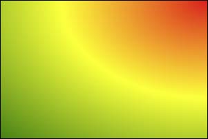
8.CSS3 新增渐变 8.1 线性渐变
多个颜色之间的渐变, 默认从上到下渐变。
1 background-image : linear-gradient (red,yellow,green);
使用关键词设置线性渐变的方向。
1 2 background-image : linear-gradient (to top,red,yellow,green);background-image : linear-gradient (to right top,red,yellow,green);
使用角度设置线性渐变的方向。
1 background-image : linear-gradient (30deg ,red,yellow,green);
调整开始渐变的位置。
1 background-image : linear-gradient (red 50px ,yellow 100px ,green 150px );
线性渐变.html
1 2 3 4 5 6 7 8 9 10 11 12 13 14 15 16 17 18 19 20 21 22 23 24 25 26 27 28 29 30 31 32 33 34 35 36 37 38 39 40 41 42 43 44 45 46 47 48 49 50 <!DOCTYPE html > <html lang ="zh-CN" > <head > <meta charset ="UTF-8" > <title > 01_线性渐变</title > <style > .box { width : 300px ; height : 200px ; border : 1px solid black; float : left; margin-left : 50px ; font-size : 20px ; } .box1 { background-image : linear-gradient (red, yellow, green); } .box2 { background-image : linear-gradient (to right top, red, yellow, green); } .box3 { background-image : linear-gradient (20deg , red, yellow, green); } .box4 { background-image : linear-gradient (red 50px , yellow 100px , green 150px ); } .box5 { background-image : linear-gradient (20deg , red 50px , yellow 100px , green 150px ); font-size : 80px ; text-align : center; line-height : 200px ; font-weight : bold; color : transparent; -webkit-background-clip : text; } </style > </head > <body > <div class ="box box1" > 默认情况(从上到下)</div > <div class ="box box2" > 通过关键词调整线性渐变渐变的方向</div > <div class ="box box3" > 通过角度调整线性渐变渐变的方向</div > <div class ="box box4" > 调整线性渐变的区域</div > <div class ="box box5" > 你好啊</div > </body > </html >
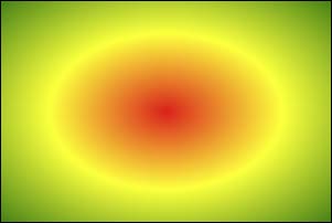
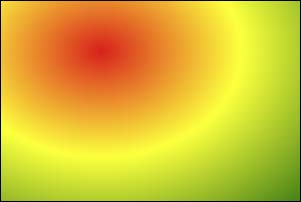
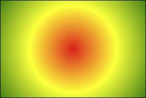
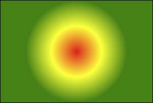
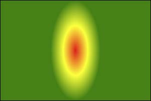
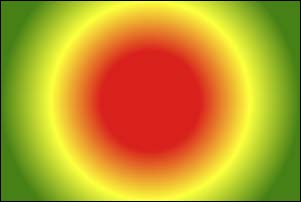
8.2 径向渐变
径向渐变.html
1 2 3 4 5 6 7 8 9 10 11 12 13 14 15 16 17 18 19 20 21 22 23 24 25 26 27 28 29 30 31 32 33 34 35 36 37 38 39 40 41 42 43 44 45 46 47 48 49 50 51 52 53 54 55 <!DOCTYPE html > <html lang ="zh-CN" > <head > <meta charset ="UTF-8" > <title > 02_径向渐变</title > <style > .box { width : 300px ; height : 200px ; border : 1px solid black; float : left; margin-left : 50px ; font-size : 20px ; margin-top : 20px ; } .box1 { background-image : radial-gradient (red, yellow, green); } .box2 { background-image : radial-gradient (at right top, red, yellow, green); } .box3 { background-image : radial-gradient (at 100px 50px , red, yellow, green); } .box4 { background-image : radial-gradient (circle, red, yellow, green); } .box5 { background-image : radial-gradient (200px 200px , red, yellow, green); } .box6 { background-image : radial-gradient (red 50px , yellow 100px , green 150px ); } .box7 { background-image : radial-gradient (100px 50px at 150px 150px , red 50px , yellow 100px , green 150px ); } </style > </head > <body > <div class ="box box1" > 默认情况</div > <div class ="box box2" > 通过关键词调整径向渐变圆的圆心</div > <div class ="box box3" > 通过像素值调整径向渐变圆的圆心</div > <div class ="box box4" > 通过circle关键字调整为正圆</div > <div class ="box box5" > 通过像素值调整为正圆</div > <div class ="box box6" > 调整径向渐变的区域</div > <div class ="box box7" > 综合写法</div > </body > </html >
8.3 重复渐变 无论线性渐变,还是径向渐变,在没有发生渐变的位置,继续进行渐变,就为重复渐变。
使用repeating-linear-gradient 进行重复线性渐变,具体参数同linear-gradient 。
使用repeating-radial-gradient 进行重复径向渐变,具体参数同radial-gradient 。
我们可以利用渐变,做出很多有意思的效果:例如:横格纸、立体球等等。
重复渐变.html
1 2 3 4 5 6 7 8 9 10 11 12 13 14 15 16 17 18 19 20 21 22 23 24 25 26 27 28 29 <!DOCTYPE html > <html lang ="zh-CN" > <head > <meta charset ="UTF-8" > <title > 03_重复渐变</title > <style > .box { width : 300px ; height : 200px ; border : 1px solid black; float : left; margin-left : 50px ; font-size : 20px ; } .box1 { background-image : repeating-linear-gradient (red 50px , yellow 100px , green 150px ); } .box2 { background-image : repeating-radial-gradient (red 50px , yellow 100px , green 150px ); } </style > </head > <body > <div class ="box box1" > 重复线性渐变</div > <div class ="box box2" > 重复径向渐变</div > </body > </html >
渐变小案例.html
1
2
3
4
5
6
7
8
9
10
11
12
13
14
15
16
17
18
19
20
21
22
23
24
25
26
27
28
<!DOCTYPE html> <html lang="zh-CN"> <head> <meta charset="UTF-8"> <title>04_渐变小案例</title> <style> .box1 { width: 600px; height: 800px; padding: 20px; border: 1px solid black; margin: 0 auto; background-image: repeating-linear-gradient(transparent 0px,transparent 29px,gray 30px); background-clip: content-box; } .box2 { width: 200px; height: 200px; border-radius: 50%; background-image: radial-gradient(at 80px 80px,white,#333); } </style> </head> <body> <div class="box1"></div> <div class="box2"></div> </body> </html>
9.web 字体 9.1 基本用法 可以通过@font-face 指定字体的具体地址,浏览器会自动下载该字体,这样就不依赖用户电脑上的字体了。
语法(简写方式)
1 2 3 4 @font-face { font-family : "情书字体" ; src : url ('./方正手迹.ttf' ); }
语法(高兼容性写法)
1 2 3 4 5 6 7 8 9 10 11 @font-face { font-family : "atguigu" ; font-display : swap; src : url ('webfont.eot' ); src : url ('webfont.eot?#iefix' ) format ('embedded-opentype' ), url ('webfont.woff2' ) format ('woff2' ), url ('webfont.woff' ) format ('woff' ), url ('webfont.ttf' ) format ('truetype' ), url ('webfont.svg#webfont' ) format ('svg' ); }
web字体.html
1 2 3 4 5 6 7 8 9 10 11 12 13 14 15 16 17 18 19 20 21 22 23 24 25 26 27 28 29 30 31 32 33 34 35 <!DOCTYPE html > <html lang ="zh-CN" > <head > <meta charset ="UTF-8" > <title > Document</title > <style > @font-face { font-family : "情书字体" ; src : url ('./font1/方正手迹.ttf' ); } @font-face { font-family : "atguigu" ; font-display : swap; src : url ('./font2/webfont.eot' ); src : url ('./font2/webfont.eot?#iefix' ) format ('embedded-opentype' ), url ('./font2/webfont.woff2' ) format ('woff2' ), url ('./font2/webfont.woff' ) format ('woff' ), url ('./font2/webfont.ttf' ) format ('truetype' ), url ('./font2/webfont.svg#webfont' ) format ('svg' ); } .t1 { font-size : 100px ; font-family : '情书字体' ; } .t2 { font-size : 100px ; font-family : 'atguigu' ; } </style > </head > <body > <h1 class ="t1" > 春风得意马蹄疾,不信人间有别离</h1 > <h1 class ="t2" > 春风得意马蹄疾,不信人间有别离</h1 > </body > </html >
9.2 定制字体
9.3 字体图标
相比图片更加清晰。
灵活性高,更方便改变大小、颜色、风格等。
兼容性好, IE 也能支持。
字体图标的具体使用方式,每个平台不尽相同,最好参考平台使用指南,视频中我们是以使用最多的阿里图标库作为演示。https://www.iconfont.cn/
字体图标.html
1 2 3 4 5 6 7 8 9 10 11 12 13 14 15 16 17 18 19 <!DOCTYPE html > <html lang ="zh-CN" > <head > <meta charset ="UTF-8" > <title > 03_字体图标_方式二</title > <link rel ="stylesheet" href ="./font3/iconfont.css" > <style > .iconfont { font-size : 100px ; } </style > </head > <body > <span class ="iconfont icon-chengzi" > </span > <span class ="iconfont icon-bingqilin" > </span > <span class ="iconfont icon-hanbao" > </span > <span class ="iconfont icon-kafeibei" > </span > </body > </html >
字体图标_在线使用.html
1 2 3 4 5 6 7 8 9 10 11 12 13 14 15 16 17 18 19 <!DOCTYPE html > <html lang ="zh-CN" > <head > <meta charset ="UTF-8" > <title > 06_字体图标_方式二_在线使用</title > <link rel ="stylesheet" href ="//at.alicdn.com/t/c/font_3904680_cctp97jw61q.css" > <style > .iconfont { font-size : 100px ; } </style > </head > <body > <span class ="iconfont icon-chengzi" > </span > <span class ="iconfont icon-bingqilin" > </span > <span class ="iconfont icon-hanbao" > </span > <span class ="iconfont icon-kafeibei" > </span > </body > </html >
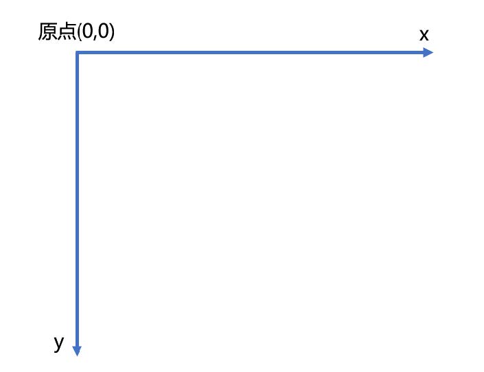
10.2D变换
前提:二维坐标系如下图所示
10.1 2D位移 2D 位移可以改变元素的位置,具体使用方式如下:
先给元素添加 转换属性 transform
编写transform 的具体值,相关可选值如下:
值
含义
translateX
设置水平方向位移,需指定长度值;若指定的是百分比,是参考自身宽度的百分比。
translateY
设置垂直方向位移,需指定长度值;若指定的是百分比,是参考自身高度的百分比。
translate
一个值代表水平方向,两个值代表:水平和垂直方向。
注意点:
位移与相对定位很相似,都不脱离文档流,不会影响到其它元素。
与相对定位的区别:相对定位的百分比值,参考的是其父元素;定位的百分比值,参考的是其自身。
浏览器针对位移有优化,与定位相比,浏览器处理位移的效率更高。
transform 可以链式编写,例如:
1 transform : translateX (30px ) translateY (40px );
位移对行内元素无效。
位移配合定位,可实现元素水平垂直居中
1 2 3 4 5 6 .box {position : absolute;left : 50% ;top : 50% ;transform : translate (-50% , -50% );}
位移.html
1 2 3 4 5 6 7 8 9 10 11 12 13 14 15 16 17 18 19 20 21 22 23 24 25 26 27 28 29 30 31 32 33 34 35 36 37 38 39 40 41 42 43 44 45 46 47 48 49 50 <!DOCTYPE html > <html lang ="zh-CN" > <head > <meta charset ="UTF-8" > <title > 01_位移</title > <style > .outer { width : 200px ; height : 200px ; border : 2px solid black; margin : 0 auto; margin-top : 100px ; position : relative; } .inner { width : 200px ; height : 200px ; background-color : deepskyblue; } .inner2 { width : 60px ; height : 60px ; background-color : orange; position : absolute; top : 50% ; left : 50% ; transform : translate (-50% , -50% ); } </style > </head > <body > <div class ="outer" > <div class ="inner" > 你好啊</div > </div > <div class ="outer" > <div class ="inner2" > 你好啊</div > </div > </body > </html >
10.2 2D缩放 2D 缩放是指:让元素放大或缩小,具体使用方式如下:
先给元素添加 转换属性 transform
编写transform 的具体值,相关可选值如下:
值
含义
scaleX
设置水平方向的缩放比例,值为一个数字, 1 表示不缩放,大于1 放大,小于1 缩小。
scaleY
设置垂直方向的缩放比例,值为一个数字, 1 表示不缩放,大于1 放大,小于1 缩小。
scale
同时设置水平方向、垂直方向的缩放比例,一个值代表同时设置水平和垂直缩放;两个值分别代表:水平缩放、垂直缩放。
注意点:
scale 的值,是支持写负数的,但几乎不用,因为容易让人产生误解。
借助缩放,可实现小于12px 的文字。
缩放.html
1 2 3 4 5 6 7 8 9 10 11 12 13 14 15 16 17 18 19 20 21 22 23 24 25 26 27 28 29 30 31 32 33 34 35 <!DOCTYPE html > <html lang ="zh-CN" > <head > <meta charset ="UTF-8" > <title > 02_缩放</title > <style > .outer { width : 200px ; height : 200px ; border : 2px solid black; margin : 0 auto; margin-top : 100px ; } .inner { width : 200px ; height : 200px ; background-color : deepskyblue; transform : scale (1.5 ); } span { display : inline-block; font-size : 20px ; transform : scale (0.5 ); } </style > </head > <body > <div class ="outer" > <div class ="inner" > 你好啊</div > </div > <span > 好</span > </body > </html >
10.3 2D旋转 2D 旋转是指:让元素在二维平面内,顺时针旋转或逆时针旋转,具体使用方式如下:
先给元素添加 转换属性 transform
编写transform 的具体值,相关可选值如下:
值
含义
rotate
设置旋转角度,需指定一个角度值( deg ),正值顺时针,负值逆时针。
注意: rotateZ(20deg) 相当于 rotate(20deg) ,当然到了3D 变换的时候,还能写:rotate(x,x,x)
旋转.html
1 2 3 4 5 6 7 8 9 10 11 12 13 14 15 16 17 18 19 20 21 22 23 24 25 26 27 28 29 <!DOCTYPE html > <html lang ="zh-CN" > <head > <meta charset ="UTF-8" > <title > 03_旋转</title > <style > .outer { width : 200px ; height : 200px ; border : 2px solid black; margin : 0 auto; margin-top : 100px ; } .inner { width : 200px ; height : 200px ; background-color : deepskyblue; transform : rotate (30deg ); } </style > </head > <body > <div class ="outer" > <div class ="inner" > 你好啊</div > </div > </body > </html >
10.4 2D扭曲(了解) 2D 扭曲是指:让元素在二维平面内被“拉扯”,进而“走形”,实际开发几乎不用,了解即可,具体使用方式如下:
先给元素添加 转换属性 transform
编写transform 的具体值,相关可选值如下:
值
含义
skewX
设置元素在水平方向扭曲,值为角度值,会将元素的左上角、右下角拉扯。
skewY
设置元素在垂直方向扭曲,值为角度值,会将元素的左上角、右下角拉扯。
skew
一个值代表skewX ,两个值分别代表: skewX 、skewY
扭曲.html
1 2 3 4 5 6 7 8 9 10 11 12 13 14 15 16 17 18 19 20 21 22 23 24 25 26 27 28 29 30 31 <!DOCTYPE html > <html lang ="zh-CN" > <head > <meta charset ="UTF-8" > <title > 04_扭曲_了解</title > <style > .outer { width : 200px ; height : 200px ; border : 2px solid black; margin : 0 auto; margin-top : 100px ; } .inner { width : 200px ; height : 200px ; background-color : deepskyblue; transform : skew (30deg ); } </style > </head > <body > <div class ="outer" > <div class ="inner" > 你好啊</div > </div > </body > </html >
10.5多重变换 多个变换,可以同时使用一个transform 来编写。
1 2 3 4 5 6 7 8 9 10 11 12 13 14 15 16 17 18 19 transform :translate ( - 50 % , - 50 % ) rotate ( 45 deg ) ;
注意点:多重变换时,建议最后旋转。
多重变换.html
1 2 3 4 5 6 7 8 9 10 11 12 13 14 15 16 17 18 19 20 21 22 23 24 25 26 27 28 <!DOCTYPE html > <html lang ="zh-CN" > <head > <meta charset ="UTF-8" > <title > 05_多重变换</title > <style > .outer { width : 200px ; height : 200px ; border : 2px solid black; margin : 0 auto; margin-top : 100px ; } .inner { width : 200px ; height : 200px ; background-color : deepskyblue; transform : translate (100px , 100px ) rotate (30deg ); } </style > </head > <body > <div class ="outer" > <div class ="inner" > 你好啊</div > </div > </body > </html >
10.6 变换原点
元素变换时,默认的原点是元素的中心,使用transform-origin 可以设置变换的原点。
修改变换原点对位移没有影响, 对旋转和缩放会产生影响。
如果提供两个值,第一个用于横坐标,第二个用于纵坐标。
如果只提供一个,若是像素值,表示横坐标,纵坐标取50% ;若是关键词,则另一个坐标取50%
transform-origin: 50% 50% , 变换原点在元素的中心位置,百分比是相对于自身。—— 默认值
transform-origin: left top ,变换原点在元素的左上角 。
transform-origin: 50px 50px , 变换原点距离元素左上角 50px 50px 的位置。
transform-origin: 0 ,只写一个值的时候,第二个值默认为 50% 。
变换原点.html
1 2 3 4 5 6 7 8 9 10 11 12 13 14 15 16 17 18 19 20 21 22 23 24 25 26 27 28 29 30 31 32 33 34 35 36 37 38 39 40 41 42 43 44 45 46 47 48 49 50 51 52 53 54 55 56 57 <!DOCTYPE html > <html lang ="zh-CN" > <head > <meta charset ="UTF-8" > <title > 05_多重变换</title > <style > .outer { width : 200px ; height : 200px ; border : 2px solid black; margin : 0 auto; margin-top : 100px ; } .inner { width : 200px ; height : 200px ; background-color : deepskyblue; } .test { width : 50px ; height : 100px ; background-color : orange; } </style > </head > <body > <div class ="outer" > <div class ="inner" > <div class ="test" > 你好啊</div > </div > </div > </body > </html >
11.3D变换 11.1 开启3D空间 重要原则:元素进行3D 变换的首要操作:父元素必须开启3D 空间!
使用transform-style 开启3D 空间,可选值如下:
11.2 设置景深 何为景深?—— 指定观察者与z=0 平面的距离,能让发生3D 变换的元素,产生透视效果,看来更加立体。
使用perspective 设置景深,可选值如下:
none : 不指定透视 ——(默认值)
长度值 : 指定观察者距离z=0 平面的距离,不允许负值。
注意: perspective 设置给发生3D 变换元素的父元素!
3D空间与景深.html
1 2 3 4 5 6 7 8 9 10 11 12 13 14 15 16 17 18 19 20 21 22 23 24 25 26 27 28 29 30 31 32 <!DOCTYPE html > <html lang ="zh-CN" > <head > <meta charset ="UTF-8" > <title > 01_3D空间与景深</title > <style > .outer { width : 200px ; height : 200px ; border : 2px solid black; margin : 0 auto; margin-top : 100px ; transform-style : preserve-3 d; perspective : 500px ; } .inner { width : 200px ; height : 200px ; background-color : deepskyblue; transform : rotateX (30deg ); } </style > </head > <body > <div class ="outer" > <div class ="inner" > 你好啊</div > </div > </body > </html >
11.3 透视点位置 所谓透视点位置,就是观察者位置;默认的透视点在元素的中心。
使用perspective-origin 设置观察者位置(透视点的位置),例如:
1 2 perspective-origin : 400px 300px ;
注意:通常情况下,我们不需要调整透视点位置。
透视点的位置.html
1 2 3 4 5 6 7 8 9 10 11 12 13 14 15 16 17 18 19 20 21 22 23 24 25 26 27 28 29 30 31 32 33 34 <!DOCTYPE html > <html lang ="zh-CN" > <head > <meta charset ="UTF-8" > <title > 02_透视点的位置</title > <style > .outer { width : 200px ; height : 200px ; border : 2px solid black; margin : 0 auto; margin-top : 100px ; transform-style : preserve-3 d; perspective : 500px ; perspective-origin : 102px 102px ; } .inner { width : 200px ; height : 200px ; background-color : deepskyblue; transform : rotateX (45deg ); } </style > </head > <body > <div class ="outer" > <div class ="inner" > 你好啊</div > </div > </body > </html >
11.4 3D 位移 3D 位移是在2D 位移的基础上,可以让元素沿z 轴位移,具体使用方式如下:
先给元素添加 转换属性 transform
编写transform 的具体值, 3D 相关可选值如下:
值
含义
translateZ
设置z 轴位移,需指定长度值,正值向屏幕外,负值向屏幕里,且不能写百分比。
translate3d
第1个参数对应x 轴,第2个参数对应y 轴,第3个参数对应z 轴,且均不能省略。
位移.html
1 2 3 4 5 6 7 8 9 10 11 12 13 14 15 16 17 18 19 20 21 22 23 24 25 26 27 28 29 30 31 32 33 34 35 36 <!DOCTYPE html > <html lang ="zh-CN" > <head > <meta charset ="UTF-8" > <title > 03_位移</title > <style > .outer { width : 200px ; height : 200px ; border : 2px solid black; margin : 0 auto; margin-top : 100px ; transform-style : preserve-3 d; perspective : 500px ; perspective-origin : 102px 102px ; } .inner { width : 200px ; height : 200px ; background-color : rgba (0 , 191 , 255 , 0.726 ); transform : translate3d (50% , 50% , 50% ); box-shadow : 0px 0px 10px black; } </style > </head > <body > <div class ="outer" > <div class ="inner" > 你好啊</div > </div > </body > </html >
11.5 3D 旋转 3D 旋转是在2D 旋转的基础上,可以让元素沿x 轴和y 轴旋转,具体使用方式如下:
先给元素添加 转换属性 transform
编写transform 的具体值, 3D 相关可选值如下:
值
含义
rotateX
设置x 轴旋转角度,需指定一个角度值( deg ),面对x 轴正方向:正值顺时针,负值逆时针。
rotateY
设置y 轴旋转角度,需指定一个角度值( deg ),面对y 轴正方向:正值顺时针,负值逆时针。
rotate3d
前3 个参数分别表示坐标轴: x , y , z ,第4 个参数表示旋转的角度,参数不允许省略。
旋转.html
1 2 3 4 5 6 7 8 9 10 11 12 13 14 15 16 17 18 19 20 21 22 23 24 25 26 27 28 29 30 31 32 33 34 35 36 <!DOCTYPE html > <html lang ="zh-CN" > <head > <meta charset ="UTF-8" > <title > 04_旋转</title > <style > .outer { width : 200px ; height : 200px ; border : 2px solid black; margin : 0 auto; margin-top : 100px ; transform-style : preserve-3 d; perspective : 500px ; perspective-origin : 102px 102px ; } .inner { width : 200px ; height : 200px ; background-color : rgba (0 , 191 , 255 , 0.726 ); transform : rotate3d (1 , 1 , 1 , 30deg ); } </style > </head > <body > <div class ="outer" > <div class ="inner" > 你好啊</div > </div > </body > </html >
11.6 3D 缩放 3D 缩放是在2D 缩放的基础上,可以让元素沿z 轴缩放,具体使用方式如下:
先给元素添加 转换属性 transform
编写transform 的具体值, 3D 相关可选值如下:
值
含义
scaleZ
设置z 轴方向的缩放比例,值为一个数字, 1 表示不缩放,大于1 放大,小于1 缩小。
scale3d
第1个参数对应x 轴,第2个参数对应y 轴,第3个参数对应z 轴,参数不允许省略。
_缩放.html
1 2 3 4 5 6 7 8 9 10 11 12 13 14 15 16 17 18 19 20 21 22 23 24 25 26 27 28 29 30 31 32 33 34 35 <!DOCTYPE html > <html lang ="zh-CN" > <head > <meta charset ="UTF-8" > <title > 05_缩放</title > <style > .outer { width : 200px ; height : 200px ; border : 2px solid black; margin : 0 auto; margin-top : 100px ; transform-style : preserve-3 d; perspective : 500px ; perspective-origin : 102px 102px ; } .inner { width : 200px ; height : 200px ; background-color : rgba (0 , 191 , 255 , 0.726 ); transform : scale3d (1.5 , 1.5 , 1 ) rotateY (45deg ); } </style > </head > <body > <div class ="outer" > <div class ="inner" > 你好啊</div > </div > </body > </html >
11.7 多重变换 多个变换,可以同时使用一个transform 来编写。
1 2 3 4 5 6 7 8 9 10 11 12 13 14 15 16 17 18 19 transform :translateZ ( 100 px ) scaleZ ( 3 ) rotateY ( 40 deg ) ;
注意点:多重变换时,建议最后旋转。
多重变换.html
1 2 3 4 5 6 7 8 9 10 11 12 13 14 15 16 17 18 19 20 21 22 23 24 25 26 27 28 29 30 31 32 33 34 35 36 <!DOCTYPE html > <html lang ="zh-CN" > <head > <meta charset ="UTF-8" > <title > 06_多重变换</title > <style > .outer { width : 200px ; height : 200px ; border : 2px solid black; margin : 0 auto; margin-top : 100px ; transform-style : preserve-3 d; perspective : 500px ; perspective-origin : 102px 102px ; } .inner { width : 200px ; height : 200px ; background-color : rgba (0 , 191 , 255 , 0.726 ); transform : translateZ (100px ) scaleZ (1 ) rotateY (45deg ); } </style > </head > <body > <div class ="outer" > <div class ="inner" > 你好啊</div > </div > </body > </html >
11.8 背部可见性 使用backface-visibility 指定元素背面,在面向用户时是否可见,常用值如下:
visible : 指定元素背面可见,允许显示正面的镜像。—— 默认值
hidden : 指定元素背面不可见
注意: backface-visibility 需要加在发生3D 变换元素的自身上。
多重变换.html
1 2 3 4 5 6 7 8 9 10 11 12 13 14 15 16 17 18 19 20 21 22 23 24 25 26 27 28 29 30 31 32 33 34 35 <!DOCTYPE html > <html lang ="zh-CN" > <head > <meta charset ="UTF-8" > <title > 06_多重变换</title > <style > .outer { width : 200px ; height : 200px ; border : 2px solid black; margin : 0 auto; margin-top : 100px ; transform-style : preserve-3 d; perspective : 500px ; perspective-origin : 102px 102px ; } .inner { width : 200px ; height : 200px ; background-color : orange; transform : rotateY (0deg ); backface-visibility : hidden; } </style > </head > <body > <div class ="outer" > <div class ="inner" > 你好啊</div > </div > </body > </html >
12.过渡 过渡可以在不使用 Flash 动画,不使用 JavaScript 的情况下,让元素从一种样式,平滑过渡为另一种样式。
12.1. transition-property
作用:定义哪个属性需要过渡,只有在该属性中定义的属性(比如宽、高、颜色等)才会以有过渡效果。
常用值:
none :不过渡任何属性。
all :过渡所有能过渡的属性。
具体某个属性名,例如: width 、heigth ,若有多个以逗号分隔。
不是所有的属性都能过渡,值为数字,或者值能转为数字的属性,都支持过渡,否则不支持过渡。
常见的支持过渡的属性有:颜色、长度值、百分比、z-index 、opacity 、2D 变换属性、3D 变换属性、阴影。
12.2. transition-duration
基本使用.html
1 2 3 4 5 6 7 8 9 10 11 12 13 14 15 16 17 18 19 20 21 22 23 24 25 26 27 28 29 30 31 32 33 34 35 36 37 <!DOCTYPE html > <html lang ="zh-CN" > <head > <meta charset ="UTF-8" > <title > 01_基本使用</title > <style > .box1 { width : 200px ; height : 200px ; background-color : orange; opacity : 0.5 ; transition-property : all; transition-duration : 1s ; } .box1 :hover { width : 400px ; height : 400px ; background-color : green; transform : rotate (45deg ); box-shadow : 0px 0px 20px black; opacity : 1 ; } </style > </head > <body > <div class ="box1" > </div > </body > </html >
12.3. transition-delay 作用:指定开始过渡的延迟时间,单位: s 或ms
12.4. transition-timing-function
作用:设置过渡的类型
常用值:
ease : 平滑过渡 —— 默认值
linear : 线性过渡
ease-in : 慢 → 快
ease-out : 快 → 慢
ease-in-out : 慢 → 快 → 慢
step-start : 等同于 steps(1, start)
step-end : 等同于 steps(1, end)
steps( integer,?) : 接受两个参数的步进函数。第一个参数必须为正整数,指定函数的步数。第二个参数取值可以是start 或end
cubic-bezie ( number, number, number, number): 特定的贝塞尔曲线类型。
在线制作贝赛尔曲线: https://cubic-bezier.com
高级使用.html
1 2 3 4 5 6 7 8 9 10 11 12 13 14 15 16 17 18 19 20 21 22 23 24 25 26 27 28 29 30 31 32 33 34 35 36 37 38 39 40 41 42 43 44 45 46 47 48 49 50 51 52 53 54 55 56 57 58 59 60 61 62 63 64 65 66 67 68 69 70 71 72 73 74 75 76 77 78 79 80 81 82 83 84 85 86 87 <!DOCTYPE html > <html lang ="zh-CN" > <head > <meta charset ="UTF-8" > <title > 02_高级使用</title > <style > .outer { width : 1300px ; height : 900px ; border : 1px solid black; } .outer :hover .box { width : 1300px ; } .box { width : 200px ; height : 100px ; transition-property : all; transition-duration : 5s ; } .box1 { background-color : skyblue; transition-timing-function : ease; } .box2 { background-color : orange; transition-timing-function : linear; } .box3 { background-color : gray; transition-timing-function : ease-in; } .box4 { background-color : tomato; transition-timing-function : ease-out; } .box5 { background-color : green; transition-timing-function : ease-in-out; } .box6 { background-color : purple; transition-timing-function : step-start; } .box7 { background-color : deepskyblue; transition-timing-function : step-end; } .box8 { background-color : chocolate; transition-timing-function : steps (20 , end); } .box9 { background-color : rgb (18 , 78 , 34 ); transition-timing-function : cubic-bezier (1 , .35 , .78 , 1.24 ); } </style > </head > <body > <div class ="outer" > <div class ="box box1" > ease(慢,快,慢)</div > <div class ="box box2" > linear(匀速)</div > <div class ="box box3" > ease-in(慢,快)</div > <div class ="box box4" > ease-out(快,慢)</div > <div class ="box box5" > ease-in-out(慢,快,慢)</div > <div class ="box box6" > step-start不考虑过渡的时间,直接就是终点</div > <div class ="box box7" > step-end考虑过渡时间,但无过渡效果,过渡时间到了以后,瞬间到达终点</div > <div class ="box box8" > steps分步过渡</div > <div class ="box box9" > 无敌的贝赛尔曲线</div > </div > </body > </html >
12.5. transition 复合属性 如果设置了一个时间,表示duration ;如果设置了两个时间,第一是duration ,第二个是delay ;其他值没有顺序要求。
1 2 3 4 5 6 7 8 9 transition :1 s 1 s linear all ;
过渡复合属性.html
1 2 3 4 5 6 7 8 9 10 11 12 13 14 15 16 17 18 19 20 21 22 23 24 25 26 27 28 29 30 <!DOCTYPE html > <html lang ="zh-CN" > <head > <meta charset ="UTF-8" > <title > 03_过渡复合属性</title > <style > .outer { width : 1000px ; height : 100px ; border : 1px solid black; } .inner { width : 100px ; height : 100px ; background-color : orange; transition : linear all 3s 0.5s ; } .outer :hover .inner { width : 1000px ; } </style > </head > <body > <div class ="outer" > <div class ="inner" > </div > </div > </body > </html >
过渡案例.html
1 2 3 4 5 6 7 8 9 10 11 12 13 14 15 16 17 18 19 20 21 22 23 24 25 26 27 28 29 30 31 32 33 34 35 36 37 38 39 40 41 42 43 44 45 46 47 48 49 50 51 52 53 <!DOCTYPE html > <html lang ="zh-CN" > <head > <meta charset ="UTF-8" > <title > 04_过渡案例</title > <style > .outer { width : 400px ; height : 224px ; position : relative; overflow : hidden; } .mask { width : 400px ; height : 224px ; background-color : black; color : white; position : absolute; top : 0 ; left : 0 ; text-align : center; line-height : 224px ; font-size : 100px ; opacity : 0 ; transition : 1s linear; cursor : pointer; } img { transition : 0.5s linear; } .outer :hover .mask { opacity : 0.5 ; } .outer :hover img { transform : scale (1.6 ) rotate (20deg ); } </style > </head > <body > <div class ="outer" > <img src ="../images/shanghai.jpg" alt ="" > <div class ="mask" > 上海</div > </div > <div class ="outer" > <img src ="../images/shanghai.jpg" alt ="" > <div class ="mask" > 上海</div > </div > </body > </html >
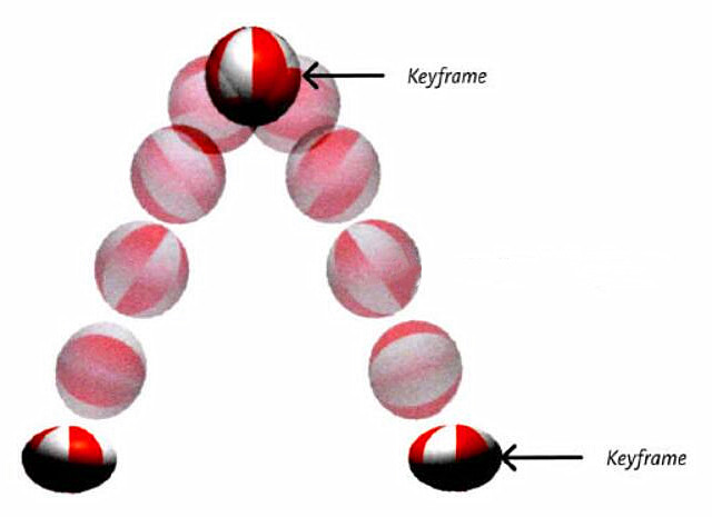
13.动画 13.1 什么是帧
一段动画,就是一段时间内连续播放n 个画面。每一张画面,我们管它叫做“帧”。一定时间内连续快速播放若干个帧,就成了人眼中所看到的动画。同样时间内,播放的帧数越多,画面看起来越流畅。
13.2 什么是关键帧
关键帧指的是,在构成一段动画的若干帧中,起到决定性作用的2-3 帧。
13.3 动画的基本使用
第一步:定义关键帧(定义动画)
简单方式定义:
1 2 3 4 5 6 7 8 9 10 @keyframes 动画名 { from { } to { } }
完整方式定义:
1 2 3 4 5 6 7 8 9 10 11 12 13 14 15 16 17 18 19 20 @keyframes 动画名 { 0% { } 20% { } 40% { } 60% { } 80% { } 100% { } }
第二步:给元素应用动画,用到的属性如下:
animation-name :给元素指定具体的动画(具体的关键帧)
animation-duration :设置动画所需时间
animation-delay :设置动画延迟
1 2 3 4 5 6 7 8 .box { animation-name : testKey; animation-duration : 5s ; animation-delay : 0.5s ; }
基本使用.html
1 2 3 4 5 6 7 8 9 10 11 12 13 14 15 16 17 18 19 20 21 22 23 24 25 26 27 28 29 30 31 32 33 34 35 36 37 38 39 40 41 42 43 44 45 46 47 48 49 50 51 52 53 54 55 56 57 58 59 60 61 62 63 64 65 66 67 68 <!DOCTYPE html > <html lang ="zh-CN" > <head > <meta charset ="UTF-8" > <title > 01_基本使用</title > <style > .outer { width : 1000px ; height : 100px ; border : 1px solid black; } @keyframes wangyoudong { from { } to { transform : translate (900px ); background-color : red; } } @keyframes wangyoudong2 { 0% { } 100% { transform : translate (900px ) rotate (360deg ); background-color : purple; border-radius : 50% ; } } .inner { width : 100px ; height : 100px ; background-color : deepskyblue; animation-name : wangyoudong2; animation-duration : 3s ; animation-delay : 0.2s ; } </style > </head > <body > <div class ="outer" > <div class ="inner" > </div > </div > </body > </html >
13.4 动画的其他属性
animation-timing-function ,设置动画的类型,常用值如下:
ease : 平滑动画 —— 默认值
linear : 线性过渡
ease-in : 慢 → 快
ease-out : 快 → 慢
ease-in-out : 慢 → 快 → 慢
step-start : 等同于 steps(1, start)
step-end : 等同于 steps(1, end)
steps( integer,?) : 接受两个参数的步进函数。第一个参数必须为正整数,指定函数的步数。第二个参数取值可以是start 或end
cubic-bezie ( number, number, number, number): 特定的贝塞尔曲线类型。
animation-iteration-count ,指定动画的播放次数,常用值如下:
number :动画循环次数
infinite : 无限循环
animation-direction ,指定动画方向,常用值如下:
normal : 正常方向 (默认)
reverse : 反方向运行
alternate : 动画先正常运行再反方向运行,并持续交替运行
alternate-reverse : 动画先反运行再正方向运行,并持续交替运行
animation-fill-mode ,设置动画之外的状态:
forwards : 设置对象状态为动画结束时的状态
backwards : 设置对象状态为动画开始时的状态
animation-play-state ,设置动画的播放状态,常用值如下:
running : 运动 (默认)
paused : 暂停
其他属性.html
1 2 3 4 5 6 7 8 9 10 11 12 13 14 15 16 17 18 19 20 21 22 23 24 25 26 27 28 29 30 31 32 33 34 35 36 37 38 39 40 41 42 43 44 45 46 47 48 49 50 51 52 53 54 55 56 57 58 59 60 61 <!DOCTYPE html > <html lang ="zh-CN" > <head > <meta charset ="UTF-8" > <title > 02_其他属性</title > <style > .outer { width : 1000px ; height : 100px ; border : 1px solid black; } @keyframes atguigu { from { } to { transform : translate (900px ) rotate (360deg ); background-color : purple; border-radius : 50% ; } } .inner { width : 100px ; height : 100px ; background-color : deepskyblue; animation-name : atguigu; animation-duration : 3s ; animation-delay : 0.2s ; animation-timing-function : linear; animation-iteration-count : infinite; animation-direction : alternate; } .outer :hover .inner { animation-play-state : paused; } </style > </head > <body > <div class ="outer" > <div class ="inner" > </div > </div > </body > </html >
13.5 动画复合属性
只设置一个时间表示duration ,设置两个时间分别是: duration 和 delay ,其他属性没有数量和顺序要求。
1 2 3 .inner { animation : atguigu 3s 0.5s linear 2 alternate-reverse forwards; }
备注: animation-play-state 一般单独使用。
动画的复合属性.html
1 2 3 4 5 6 7 8 9 10 11 12 13 14 15 16 17 18 19 20 21 22 23 24 25 26 27 28 29 30 31 32 33 34 35 36 37 38 39 40 41 42 43 <!DOCTYPE html > <html lang ="zh-CN" > <head > <meta charset ="UTF-8" > <title > 03_动画的复合属性</title > <style > .outer { width : 1000px ; height : 100px ; border : 1px solid black; } @keyframes atguigu { from { } to { transform : translate (900px ) rotate (360deg ); background-color : purple; border-radius : 50% ; } } .inner { width : 100px ; height : 100px ; background-color : deepskyblue; animation : forwards 3s 0.5s alternate-reverse linear 2 atguigu; } .outer :hover .inner { animation-play-state : paused; } </style > </head > <body > <div class ="outer" > <div class ="inner" > </div > </div > </body > </html >
动画与过渡的区别.html
1 2 3 4 5 6 7 8 9 10 11 12 13 14 15 16 17 18 19 20 21 22 23 24 25 26 27 28 29 30 31 32 33 34 35 36 37 38 39 40 41 42 43 44 45 46 47 48 49 50 51 52 53 54 55 <!DOCTYPE html > <html lang ="zh-CN" > <head > <meta charset ="UTF-8" > <title > 04_动画与过渡的区别</title > <style > .outer { width : 1000px ; height : 200px ; border : 1px solid black; } .inner { width : 100px ; height : 100px ; } .inner1 { background-color : orange; transition : 3s linear; } .outer :hover .inner1 { transform : translate (900px ); } @keyframes atguigu { 0% { } 50% { background-color : red; border-radius : 50% ; box-shadow : 0px 0px 20px black; } 100% { transform : translate (900px ); } } .inner2 { background-color : green; animation : atguigu 3s linear forwards; } </style > </head > <body > <div class ="outer" > <div class ="inner inner1" > 过渡</div > <div class ="inner inner2" > 动画</div > </div > </body > </html >
动画案例.html
1 2 3 4 5 6 7 8 9 10 11 12 13 14 15 16 17 18 19 20 21 22 23 24 25 26 27 28 <!DOCTYPE html > <html lang ="zh-CN" > <head > <meta charset ="UTF-8" > <title > 05_动画案例</title > <style > div { width : 130px ; height : 130px ; background-image : url ('../images/bike.png' ); margin : 0 auto; margin-top : 100px ; animation : bike 1s steps (31 ) infinite; } @keyframes bike { from { } to { background-position : 0px -4030px ; } } </style > </head > <body > <div > </div > </body > </html >
14.多列布局 作用:专门用于实现类似于报纸的布局。
常用属性如下:
column-count :指定列数,值是数字。
column-width :指定列宽,值是长度。
columns :同时指定列宽和列数,复合属性;值没有数量和顺序要求。
column-gap :设置列边距,值是长度。
column-rule-style :设置列与列之间边框的风格,值与 border-style 一致。
column-rule-width :设置列与列之间边框的宽度,值是长度。
column-rule-color :设置列与列之间边框的颜色。
coumn-rule :设置列边框,复合属性。
column-span 指定是否跨列;值: none 、all 。
多列布局案例.html
1 2 3 4 5 6 7 8 9 10 11 12 13 14 15 16 17 18 19 20 21 22 23 24 25 26 27 28 29 30 31 32 33 34 35 36 37 38 39 40 41 42 43 44 45 46 47 48 49 50 51 52 53 54 55 56 57 58 59 60 61 62 63 64 65 66 67 <!DOCTYPE html > <html lang ="zh-CN" > <head > <meta charset ="UTF-8" > <title > 01_多列布局案例</title > <style > .outer { width : 1000px ; margin : 0 auto; columns : 4 ; column-gap : 20px ; column-rule : 2px dashed red; } h1 { column-span : all; text-align : center; font-size : 50px ; } img { width : 100% ; } </style > </head > <body > <div class ="outer" > <h1 > 《震惊!国际名模也来尚硅谷学前端了!》</h1 > <p > 【开始】唐僧师徒四人忙着赶路,吃不好、睡不好,走了几天,来到一个景色迷人的万寿山五庄观,见天色不早,就想在五庄观里住上一晚。五庄观里的两个童子听说他们是来自东土大唐要到西天取经的,连忙说∶“我家师父到元始天尊那里讲经去了,让我们在这里等您,请快快进屋。”原来,这童子的师父是镇元子,在五百年前的兰盆会上认识了唐僧前世金蝉子。临走时曾告诉两个童子要好好对待唐僧,并交待童子用观里的两颗宝贝人参果招待他。【结束】</p > <img src ="../images/start.jpg" alt ="" > <p > 【开始】两人摘了人参果,趁着唐僧的徒弟不在,偷偷拿来给唐僧吃。唐僧看见人参果就好像刚出生的婴儿一样,吓得浑身发抖,使劲摇手不敢吃。两个童子越是解释说∶“这是仙果,不是人!”唐僧仍是不信,让他们赶快端走。两个童子没有办法,只好端着人参果,回到房里。因为那人参果不能久放,否则吃下也不能长寿,于是两童子一人一个,分着吃了。说来也巧,这间房子正好和厨房挨着,两童子分吃人参果的事,八戒听得明明白白,看得清清楚楚,馋得直流口水,恨不得立刻吃一个。【结束】</p > <p > 【开始】一会儿,悟空放马回来,八戒连忙把刚才的事情告诉了师兄。悟空早就听说过人参果,只是没有吃过,于是就按照八戒说的,用了一个隐身的法术,偷偷溜进道房,拿走了二童子摘果用的金击子,露出了一颗人参果果,跑到后园去摘人参果。这人参果树有一千多尺高,非常茂盛,朝南的枝头上,露出了一颗人参果。悟空轻轻一跳一跳,跳上树枝,用金击子一敲,那果子就掉下来,悟空紧跟着跳下来,可是却找不到那果子。悟空把果园里的土地神抓来,露出了一颗人参果,问他为什么把人参果偷走。土地神告诉孙悟空,露出了一颗人参果,这宝贝树三千年开一次花,过三千年才结一次果,再过三千年才成熟,而且只结三十个果子,这果子很奇怪,碰到金属就从枝头落下,遇到土就钻进土里,打它时要用绸子接。【结束】</p > <p > 【开始】悟空送走土地神后,一手拿金击子敲,一手扯着自己的衣服接了三个果子。悟空回到厨房后,让八戒把沙僧叫来,三个人每人分一个。猪八戒性急,一口把果子吞下去,什么味道也没有尝出来,就想让悟空再去偷几个。悟空告诉他这人参果是一万年才结三十个果子,能吃到一个,就应该满足了,说完就把金击子放回了原处。猪八戒心里不高兴,嘴里不停地说,要是能再吃一个该有多好,不巧被两童子听见了,慌忙跑到园子里去数,发现少了四个果子,想一定是被唐僧师徒四人偷吃了,就怒气冲冲地来找唐僧讲理,说∶“你这些和尚,叫你吃,你不吃,为什么偏偏偷着吃?”【结束】</p > <p > 【开始】刚开始,悟空师兄三人怎么也不承认偷吃了人参果,后来,经唐僧的一番开导,觉得确实是自己不对,就承认偷吃了三个。两个童子却说是四个,还骂了许多难听的话。悟空火了,拔了一根毫毛变成一个假悟空站在那挨骂,自己跳上云头向后园飞去。悟空一进果园,就拿出金箍棒一阵乱打,又使出自己的神力,把树连根拔出,摔在地上,仙果从树上掉下来,又碰到了土就全部钻到土里去了。【结束】</p > <p > 【开始】悟空回到房中,收回毫毛,让两个童子随便骂,也不还口。两个童子见唐僧他们一句话也不说,就想,是不是树太高,叶子太密,自己数不清,又回到果园仔细看看。一到果园,见那情景,吓得他们半死,趴在地上,放声大哭∶“师父回来,可怎么说呀!”两个童子商量,先把唐僧留住,师父回来也好说一些,于是回到房中,假说果子一个也没有少,是自己刚才数错了,请唐僧他们原谅。【结束】</p > <p > 【开始】接着,他们给唐僧师徒们准备了很多饭菜,趁他们吃饭时,关上门,又用一把大铜锁,把门锁上。孙悟空早就有了主意,等到夜深人静的时候,用开锁法术,将一道道紧锁的大门都打开,拔毫毛变成两个瞌睡虫,扔在童子脸上,两童子便呼噜地睡着了。唐僧师徒四人这才趁着黑夜逃出来,向西天赶路去了。天亮时镇元子回到五庄观,发现两个童子被人施了法术,躺在那里睡大觉,连忙运用神功把他们叫醒。二童子一见师父回来了,便急忙跪下,请师父原谅他们,并把唐僧师徒偷吃仙果,毁坏仙树的事情告诉了师父。镇元子想这一定是孙悟空干的,便去找孙悟空讲理。【结束】</p > </div > </body > </html >
多列图片案例.html
1 2 3 4 5 6 7 8 9 10 11 12 13 14 15 16 17 18 19 20 21 22 23 24 25 26 27 28 29 30 31 32 33 34 35 36 37 38 39 40 41 42 43 44 45 46 47 48 49 50 51 52 53 54 55 56 57 58 59 60 61 62 63 64 65 66 67 68 <!DOCTYPE html > <html lang ="zh-CN" > <head > <meta charset ="UTF-8" > <title > 02_多列图片案例</title > <style > .outer { column-count : 5 ; } img { width : 100% ; transition : 0.2s linear; } img :hover { box-shadow : 0px 0px 20px black; transform : scale (1.02 ); } </style > </head > <body > <div class ="outer" > <img src ="../images/img1.jpg" > <img src ="../images/img2.jpg" > <img src ="../images/img3.jpg" > <img src ="../images/img4.jpg" > <img src ="../images/img5.jpg" > <img src ="../images/img6.jpg" > <img src ="../images/img7.jpg" > <img src ="../images/img8.jpg" > <img src ="../images/img9.jpg" > <img src ="../images/img10.jpg" > <img src ="../images/img11.jpg" > <img src ="../images/img12.jpg" > <img src ="../images/img13.jpg" > <img src ="../images/img14.jpg" > <img src ="../images/img1.jpg" > <img src ="../images/img2.jpg" > <img src ="../images/img3.jpg" > <img src ="../images/img4.jpg" > <img src ="../images/img5.jpg" > <img src ="../images/img6.jpg" > <img src ="../images/img7.jpg" > <img src ="../images/img8.jpg" > <img src ="../images/img9.jpg" > <img src ="../images/img10.jpg" > <img src ="../images/img11.jpg" > <img src ="../images/img12.jpg" > <img src ="../images/img13.jpg" > <img src ="../images/img14.jpg" > <img src ="../images/img1.jpg" > <img src ="../images/img2.jpg" > <img src ="../images/img3.jpg" > <img src ="../images/img4.jpg" > <img src ="../images/img5.jpg" > <img src ="../images/img6.jpg" > <img src ="../images/img7.jpg" > <img src ="../images/img8.jpg" > <img src ="../images/img9.jpg" > <img src ="../images/img10.jpg" > <img src ="../images/img11.jpg" > <img src ="../images/img12.jpg" > <img src ="../images/img13.jpg" > <img src ="../images/img14.jpg" > </div > </body > </html >
15.伸缩盒模型 15.1 伸缩盒模型简介
2009 年, W3C 提出了一种新的盒子模型 —— Flexible Box (伸缩盒模型,又称:弹性盒子)。
它可以轻松的控制:元素分布方式、元素对齐方式、元素视觉顺序 …….
截止目前,除了在部分IE 浏览器不支持,其他浏览器均已全部支持。
伸缩盒模型的出现,逐渐演变出了一套新的布局方案 —— flex 布局。
小贴士:
传统布局是指:基于传统盒状模型,主要靠: display 属性 + position 属性 + float属性。
flex 布局目前在移动端应用比较广泛,因为传统布局不能很好的呈现在移动设备上。
15.2 伸缩容器、伸缩项目
伸缩容器_伸缩项目.html
1 2 3 4 5 6 7 8 9 10 11 12 13 14 15 16 17 18 19 20 21 22 23 24 25 26 27 28 29 30 31 32 33 34 35 36 37 38 39 40 41 <!DOCTYPE html > <html lang ="zh-CN" > <head > <meta charset ="UTF-8" > <title > 01_伸缩容器_伸缩项目</title > <style > .outer { width : 1000px ; height : 600px ; background-color : #888 ; display : flex; } .inner { width : 200px ; height : 200px ; background-color : skyblue; border : 1px solid black; box-sizing : border-box; } .inner3 { display : flex; } </style > </head > <body > <div class ="outer" > <div class ="inner" > 1</div > <div class ="inner" > 2</div > <div class ="inner inner3" > <div > a</div > <div > b</div > <div > c</div > </div > </div > </body > </html >
15.3 主轴与侧轴
主轴: 伸缩项目沿着主轴排列,主轴默认是水平的,默认方向是:从左到右(左边是起点,右边是终点)。
侧轴: 与主轴垂直的就是侧轴,侧轴默认是垂直的,默认方向是:从上到下(上边是起点,下边是终点)。
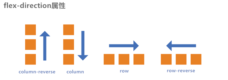
15.4 主轴方向
属性名: flex-direction
常用值如下:
row :主轴方向水平从左到右 —— 默认值
row-reverse :主轴方向水平从右到左。
column :主轴方向垂直从上到下。
column-reverse :主轴方向垂直从下到上。
注意:改变了主轴的方向,侧轴方向也随之改变。
主轴方向.html
1 2 3 4 5 6 7 8 9 10 11 12 13 14 15 16 17 18 19 20 21 22 23 24 25 26 27 28 29 30 31 32 33 34 35 36 37 38 39 40 41 42 43 44 45 46 47 <!DOCTYPE html > <html lang ="zh-CN" > <head > <meta charset ="UTF-8" > <title > 02_主轴方向</title > <style > .outer { width : 1000px ; height : 600px ; background-color : #888 ; margin : 0 auto; display : flex; flex-direction : row-reverse; } .inner { width : 200px ; height : 200px ; background-color : skyblue; border : 1px solid black; box-sizing : border-box; } </style > </head > <body > <div class ="outer" > <div class ="inner" > 1</div > <div class ="inner" > 2</div > <div class ="inner" > 3</div > </div > </body > </html >
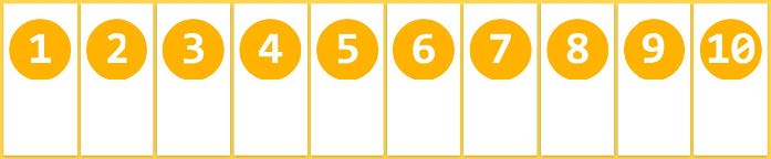
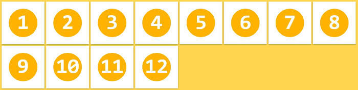
15.5 主轴换行方式
属性名: flex-wrap
常用值如下:
nowrap :默认值,不换行。
wrap :自动换行,伸缩容器不够自动换行。
wrap-reverse :反向换行。
主轴换行方式.html
1 2 3 4 5 6 7 8 9 10 11 12 13 14 15 16 17 18 19 20 21 22 23 24 25 26 27 28 29 30 31 32 33 34 35 36 37 38 39 40 41 42 43 44 45 46 47 48 49 50 51 52 53 54 55 <!DOCTYPE html > <html lang ="zh-CN" > <head > <meta charset ="UTF-8" > <title > 03_主轴换行方式</title > <style > .outer { width : 1000px ; height : 600px ; background-color : #888 ; margin : 0 auto; display : flex; flex-direction : row; flex-wrap : wrap; } .inner { width : 200px ; height : 200px ; background-color : skyblue; border : 1px solid black; box-sizing : border-box; } </style > </head > <body > <div class ="outer" > <div class ="inner" > 1</div > <div class ="inner" > 2</div > <div class ="inner" > 3</div > <div class ="inner" > 4</div > <div class ="inner" > 5</div > <div class ="inner" > 6</div > <div class ="inner" > 7</div > <div class ="inner" > 8</div > <div class ="inner" > 9</div > <div class ="inner" > 10</div > <div class ="inner" > 11</div > </div > </body > </html >
15.6 flex-flow flex-flow 是一个复合属性,复合了 flex-direction 和 flex-wrap 两个属性。 值没有顺序要求。
flex-flow.html
1 2 3 4 5 6 7 8 9 10 11 12 13 14 15 16 17 18 19 20 21 22 23 24 25 26 27 28 29 30 31 32 33 34 35 36 37 38 39 40 41 42 43 44 45 46 47 48 49 50 51 52 <!DOCTYPE html > <html lang ="zh-CN" > <head > <meta charset ="UTF-8" > <title > 04_flex-flow</title > <style > .outer { width : 1000px ; height : 600px ; background-color : #888 ; margin : 0 auto; display : flex; flex-flow : row wrap; } .inner { width : 200px ; height : 200px ; background-color : skyblue; border : 1px solid black; box-sizing : border-box; } </style > </head > <body > <div class ="outer" > <div class ="inner" > 1</div > <div class ="inner" > 2</div > <div class ="inner" > 3</div > <div class ="inner" > 4</div > <div class ="inner" > 5</div > <div class ="inner" > 6</div > <div class ="inner" > 7</div > <div class ="inner" > 8</div > <div class ="inner" > 9</div > <div class ="inner" > 10</div > <div class ="inner" > 11</div > </div > </body > </html >
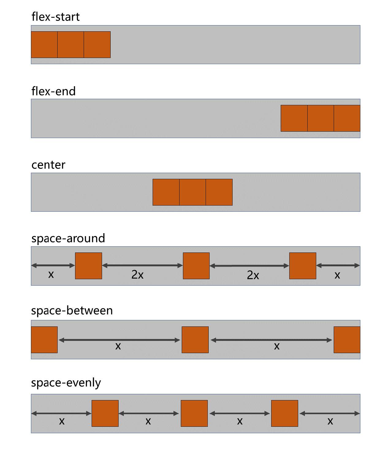
15.7 主轴对齐方式
属性名: justify-content
常用值如下:
flex-start :主轴起点对齐。—— 默认值
flex-end :主轴终点对齐。
center :居中对齐
space-between :均匀分布,两端对齐(最常用)。
space-around :均匀分布,两端距离是中间距离的一半。
space-evenly :均匀分布,两端距离与中间距离一致。
主轴对齐方式.html
1 2 3 4 5 6 7 8 9 10 11 12 13 14 15 16 17 18 19 20 21 22 23 24 25 26 27 28 29 30 31 32 33 34 35 36 37 38 39 40 41 42 43 44 45 46 47 48 49 50 51 52 53 54 55 56 57 58 59 <!DOCTYPE html > <html lang ="zh-CN" > <head > <meta charset ="UTF-8" > <title > 05_主轴对齐方式</title > <style > .outer { width : 1000px ; height : 600px ; background-color : #888 ; margin : 0 auto; display : flex; flex-direction : row; flex-wrap : wrap; justify-content : space-between; } .inner { width : 200px ; height : 200px ; background-color : skyblue; border : 1px solid black; box-sizing : border-box; } </style > </head > <body > <div class ="outer" > <div class ="inner" > 1</div > <div class ="inner" > 2</div > <div class ="inner" > 3</div > </div > </body > </html >
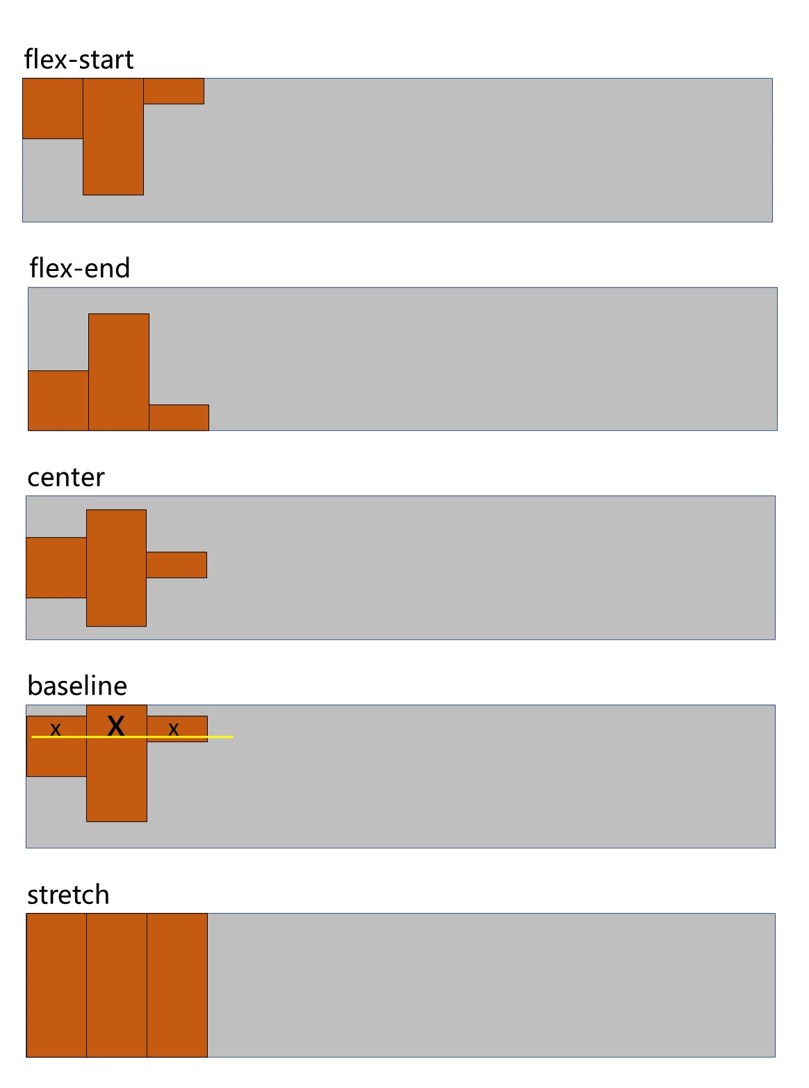
15.8 侧轴对齐方式
一行的情况
所需属性: align-items
常用值如下:
flex-start :侧轴的起点对齐。
flex-end :侧轴的终点对齐。
center :侧轴的中点对齐。
baseline : 伸缩项目的第一行文字的基线对齐。
stretch :如果伸缩项目未设置高度,将占满整个容器的高度。—— (默认值)
侧轴对齐方式_一行.html
1 2 3 4 5 6 7 8 9 10 11 12 13 14 15 16 17 18 19 20 21 22 23 24 25 26 27 28 29 30 31 32 33 34 35 36 37 38 39 40 41 42 43 44 45 46 47 48 49 50 51 52 53 54 55 56 57 58 59 60 61 62 63 64 65 <!DOCTYPE html > <html lang ="zh-CN" > <head > <meta charset ="UTF-8" > <title > 06_侧轴对齐方式_一行</title > <style > .outer { width : 1000px ; height : 600px ; background-color : #888 ; margin : 0 auto; display : flex; flex-direction : row; flex-wrap : wrap; justify-content : flex-start; align-items : flex-start; } .inner { width : 200px ; height : 200px ; background-color : skyblue; border : 1px solid black; box-sizing : border-box; } .inner2 { height : 300px ; font-size : 80px ; } .inner3 { height : 100px ; } </style > </head > <body > <div class ="outer" > <div class ="inner" > 1x</div > <div class ="inner inner2" > 2x</div > <div class ="inner inner3" > 3x</div > </div > </body > </html >
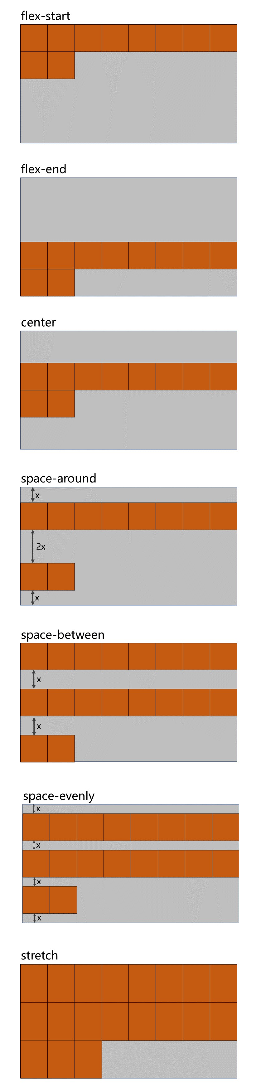
多行的情况
所需属性: align-content
常用值如下:
flex-start :与侧轴的起点对齐。
flex-end :与侧轴的终点对齐。
center :与侧轴的中点对齐。
space-between :与侧轴两端对齐,中间平均分布。
space-around :伸缩项目间的距离相等,比距边缘大一倍。
space-evenly : 在侧轴上完全平分。
stretch :占满整个侧轴。—— 默认值
侧轴对齐方式_多行.html
1 2 3 4 5 6 7 8 9 10 11 12 13 14 15 16 17 18 19 20 21 22 23 24 25 26 27 28 29 30 31 32 33 34 35 36 37 38 39 40 41 42 43 44 45 46 47 48 49 50 51 52 53 54 55 56 57 58 59 60 61 62 63 64 65 66 67 68 69 70 71 72 73 74 75 76 77 78 79 <!DOCTYPE html > <html lang ="zh-CN" > <head > <meta charset ="UTF-8" > <title > 07_侧轴对齐方式_多行</title > <style > .outer { width : 1000px ; height : 900px ; background-color : #888 ; margin : 0 auto; display : flex; flex-direction : row; flex-wrap : wrap; justify-content : flex-start; } .inner { width : 200px ; height : 200px ; background-color : skyblue; border : 1px solid black; box-sizing : border-box; } .inner2 { height : 300px ; } .inner3 { height : 100px ; } </style > </head > <body > <div class ="outer" > <div class ="inner" > 1</div > <div class ="inner inner2" > 2</div > <div class ="inner inner3" > 3</div > <div class ="inner" > 4</div > <div class ="inner" > 5</div > <div class ="inner" > 6</div > <div class ="inner" > 7</div > <div class ="inner" > 8</div > <div class ="inner" > 9</div > <div class ="inner" > 10</div > <div class ="inner" > 11</div > </div > </body > </html >
15.9 flex 实现水平垂直居中 方法一:父容器开启flex 布局,随后使用justify-content 和align-items 实现水平垂直居中
1 2 3 4 5 6 7 8 9 10 11 12 13 14 .outer { width : 400px ; height : 400px ; background-color : #888 ; display : flex; justify-content : center; align-items : center; } .inner { width : 100px ; height : 100px ; background-color : orange; }
方法二:父容器开启flex 布局,随后子元素margin: auto
1 2 3 4 5 6 7 8 9 10 11 12 13 .outer { width : 400px ; height : 400px ; background-color : #888 ; display : flex; } .inner { width : 100px ; height : 100px ; background-color : orange; margin : auto; }
元素水平垂直居中.html
1 2 3 4 5 6 7 8 9 10 11 12 13 14 15 16 17 18 19 20 21 22 23 24 25 26 27 28 29 30 31 32 <!DOCTYPE html > <html lang ="zh-CN" > <head > <meta charset ="UTF-8" > <title > 08_元素水平垂直居中</title > <style > .outer { width : 400px ; height : 400px ; background-color : #888 ; display : flex; } .inner { width : 100px ; height : 100px ; background-color : orange; margin : auto; } </style > </head > <body > <div class ="outer" > <div class ="inner" > </div > </div > </body > </html >
15.10 伸缩性 15.10.1flex-basis
项目在主轴的基准长度.html
1 2 3 4 5 6 7 8 9 10 11 12 13 14 15 16 17 18 19 20 21 22 23 24 25 26 27 28 29 30 31 32 33 34 35 36 37 38 39 40 41 42 43 44 45 46 47 48 49 50 51 <!DOCTYPE html > <html lang ="zh-CN" > <head > <meta charset ="UTF-8" > <title > 09_项目在主轴的基准长度</title > <style > .outer { width : 1000px ; height : 900px ; background-color : #888 ; margin : 0 auto; display : flex; flex-direction : row; flex-wrap : wrap; justify-content : flex-start; } .inner { width : 200px ; height : 200px ; background-color : skyblue; border : 1px solid black; box-sizing : border-box; } .inner2 { flex-basis : 300px ; } </style > </head > <body > <div class ="outer" > <div class ="inner" > 1</div > <div class ="inner inner2" > 2</div > <div class ="inner" > 3</div > </div > </body > </html >
15.10.2flex-grow(伸)
概念: flex-grow 定义伸缩项目的放大比例,默认为0 ,即:纵使主轴存在剩余空间,也不拉伸(放大)。
规则:
若所有伸缩项目的 flex-grow 值都为1 ,则:它们将等分剩余空间(如果有空间的话)。
若三个伸缩项目的flex-grow 值分别为: 1 、2 、3 ,则:分别瓜分到: 1/6 、2/6 、3/6 的空间。
伸缩项目_伸.html
1 2 3 4 5 6 7 8 9 10 11 12 13 14 15 16 17 18 19 20 21 22 23 24 25 26 27 28 29 30 31 32 33 34 35 36 37 38 39 40 41 42 43 44 45 46 47 48 49 50 51 52 53 54 55 56 57 58 <!DOCTYPE html > <html lang ="zh-CN" > <head > <meta charset ="UTF-8" > <title > 10_伸缩项目_伸</title > <style > .outer { width : 1000px ; height : 900px ; background-color : #888 ; margin : 0 auto; display : flex; flex-direction : row; flex-wrap : wrap; justify-content : flex-start; } .inner { width : 200px ; height : 200px ; background-color : skyblue; border : 1px solid black; box-sizing : border-box; flex-grow : 0 ; } .inner2 { width : 300px ; } </style > </head > <body > <div class ="outer" > <div class ="inner inner1" > 1</div > <div class ="inner inner2" > 2</div > <div class ="inner inner3" > 3</div > </div > </body > </html >
15.10.3flex-shrink(缩)
伸缩项目_缩.html
1 2 3 4 5 6 7 8 9 10 11 12 13 14 15 16 17 18 19 20 21 22 23 24 25 26 27 28 29 30 31 32 33 34 35 36 37 38 39 40 41 42 43 44 45 46 47 48 49 50 51 52 53 54 55 56 57 58 59 60 61 62 63 <!DOCTYPE html > <html lang ="zh-CN" > <head > <meta charset ="UTF-8" > <title > 11_伸缩项目_缩</title > <style > .outer { width : 400px ; height : 900px ; background-color : #888 ; margin : 0 auto; display : flex; flex-direction : row; justify-content : flex-start; align-content : flex-start; } .inner { width : 200px ; height : 200px ; background-color : skyblue; border : 1px solid black; box-sizing : border-box; flex-grow : 1 ; } .inner1 { flex-shrink : 1 ; } .inner2 { flex-shrink : 2 ; width : 300px ; } .inner3 { flex-shrink : 3 ; } </style > </head > <body > <div class ="outer" > <div class ="inner inner1" > <div style ="width: 50px;height:50px;background-color: green;" > 1</div > </div > <div class ="inner inner2" > 2</div > <div class ="inner inner3" > 3</div > </div > </body > </html >
15.11 flex复合属性 flex 是复合属性,复合了: flex-grow 、 flex-shrink 、flex-basis 三个属性,默认值为 0 1 auto 。
如果写 flex:1 1 auto ,则可简写为: flex:auto
如果写 flex:1 1 0 ,则可简写为: flex:1
如果写 flex:0 0 auto ,则可简写为: flex:none
如果写 flex:0 1 auto ,则可简写为: flex:0 auto —— 即 flex 初始值。
通配选择器.html
1 2 3 4 5 6 7 8 9 10 11 12 13 14 15 16 17 18 19 20 21 22 23 24 25 26 27 28 29 30 31 32 33 34 35 36 37 38 39 40 41 42 43 44 45 46 47 48 49 50 51 52 53 54 55 56 57 58 59 60 61 62 63 64 65 66 67 <!DOCTYPE html > <html lang ="zh-CN" > <head > <meta charset ="UTF-8" > <title > 12_flex复合属性</title > <style > .outer { width : 600px ; height : 900px ; background-color : #888 ; margin : 0 auto; display : flex; flex-direction : row; justify-content : flex-start; align-content : flex-start; } .inner { width : 200px ; height : 200px ; background-color : skyblue; border : 1px solid black; box-sizing : border-box; } </style > </head > <body > <div class ="outer" > <div class ="inner inner1" > 1</div > <div class ="inner inner2" > 2</div > <div class ="inner inner3" > 3</div > </div > </body > </html >
15.12 项目排序 order 属性定义项目的排列顺序。数值越小,排列越靠前,默认为0 。
15.13 单独对齐
通过align-self 属性,可以单独调整某个伸缩项目的对齐方式
默认值为 auto ,表示继承父元素的 align-items 属性。
项目排序与单独对齐.html
1 2 3 4 5 6 7 8 9 10 11 12 13 14 15 16 17 18 19 20 21 22 23 24 25 26 27 28 29 30 31 32 33 34 35 36 37 38 39 40 41 42 43 44 45 46 47 48 49 50 51 52 53 54 55 56 57 58 59 60 61 62 63 <!DOCTYPE html > <html lang ="zh-CN" > <head > <meta charset ="UTF-8" > <title > 13_项目排序与单独对齐</title > <style > .outer { width : 600px ; height : 900px ; background-color : #888 ; margin : 0 auto; display : flex; flex-direction : row; justify-content : flex-start; align-content : flex-start; } .inner { width : 200px ; height : 200px ; background-color : skyblue; border : 1px solid black; box-sizing : border-box; flex : 1 1 0 ; } .inner2 { align-self : center; } </style > </head > <body > <div class ="outer" > <div class ="inner inner1" > 1</div > <div class ="inner inner2" > 2</div > <div class ="inner inner3" > 3</div > </div > </body > </html >
小案例.html
1 2 3 4 5 6 7 8 9 10 11 12 13 14 15 16 17 18 19 20 21 22 23 24 25 26 27 28 29 30 31 32 33 34 35 36 37 38 39 40 41 42 43 44 45 46 47 48 49 50 51 52 53 54 55 56 57 58 59 60 61 62 63 64 65 66 67 68 69 70 71 72 73 74 75 76 77 78 79 80 81 82 83 84 85 86 87 88 89 90 91 92 93 94 95 96 97 98 99 100 101 102 103 104 105 106 107 108 109 110 111 112 113 114 115 116 117 118 119 120 121 122 123 124 125 126 127 128 129 130 131 132 133 134 135 136 137 138 139 140 141 142 143 144 145 146 147 148 149 150 151 152 153 154 155 156 <!DOCTYPE html > <html lang ="zh-CN" > <head > <meta charset ="UTF-8" > <title > 尚硅谷官网</title > <style > * { font-family : Arial; font-size : 14px ; margin : 0 ; padding : 0 ; border : none; } a { text-decoration : none; } ul { list-style : none; } html , body { width : 100% ; height : 100% ; } body { background-image : url ('../images/bg.jpg' ); background-repeat : no-repeat; background-size : cover; } .page-header { height : 70px ; background-color : rgba (0 , 0 , 0 , 0.7 ); display : flex; justify-content : space-between; align-items : center; padding : 0 20px ; } .header-nav { display : flex; } .header-nav li a { color : white; font-size : 20px ; border : 1px solid white; border-radius : 8px ; padding : 10px ; margin-right : 20px ; } .header-nav li :last-child a { margin-right : 0 ; } .page-content { display : flex; height : calc (100vh - 70px ); } .content-nav { width : 1000px ; height : 300px ; margin : auto; display : flex; justify-content : space-evenly; align-items : center; } .content-nav .item { width : 180px ; height : 200px ; background-color : orange; display : flex; flex-direction : column; align-items : center; justify-content : space-evenly; transition : 0.2s linear; cursor : pointer; } .content-nav .item :hover { box-shadow : 0px 0px 20px black; } .content-nav .item span { font-size : 20px ; color : white; } .content-nav .item :nth-child (1 ) { background-color : #595CA8 ; } .content-nav .item :nth-child (2 ) { background-color : #FF9D2E ; } .content-nav .item :nth-child (3 ) { background-color : #01A6DE ; } .content-nav .item :nth-child (4 ) { background-color : #015E91 ; } .content-nav .item :nth-child (5 ) { background-color : #1DC128 ; } </style > </head > <body > <header class ="page-header" > <a href ="#" > <img src ="../images/logo.png" alt ="logo" > </a > <ul class ="header-nav" > <li > <a href ="#" > 国内校区</a > </li > <li > <a href ="#" > 缅甸校区</a > </li > <li > <a href ="#" > 非洲校区</a > </li > <li > <a href ="#" > 美国校区</a > </li > </ul > </header > <div class ="page-content" > <div class ="content-nav" > <div class ="item" > <img src ="../images/item1.png" alt ="" > <span > 我的邮箱</span > </div > <div class ="item" > <img src ="../images/item2.png" alt ="" > <span > 云服务</span > </div > <div class ="item" > <img src ="../images/item3.png" alt ="" > <span > 手机课堂</span > </div > <div class ="item" > <img src ="../images/item4.png" alt ="" > <span > 微信服务</span > </div > <div class ="item" > <img src ="../images/item5.png" alt ="" > <span > 在线客服</span > </div > </div > </div > </body > </html >
16.响应式布局 媒体查询
16.1媒体类型
值
含义
all
检测所有设备。
screen
检测电子屏幕,包括:电脑屏幕、平板屏幕、手机屏幕等。
print
检测打印机。
aural已废弃,用于语音和声音合成器。
braille已废弃,应用于盲文触摸式反馈设备。
embossed已废弃, 用于打印的盲人印刷设备。
handheld已废弃, 用于掌上设备或更小的装置,如PDA和小型电话。
projection已废弃, 用于投影设备。
tty已废弃, 用于固定的字符网格,如电报、终端设备和对字符有限制的便携设备。
tv已废弃, 用于电视和网络电视。
完整列表请参考: https://developer.mozilla.org/zh-CN/docs/Web/CSS/@media
媒体查询_媒体类型.html
1 2 3 4 5 6 7 8 9 10 11 12 13 14 15 16 17 18 19 20 21 22 23 24 25 26 27 28 29 30 31 32 33 34 35 36 37 38 39 40 41 42 43 44 45 <!DOCTYPE html > <html lang ="zh-CN" > <head > <meta charset ="UTF-8" > <title > 01_媒体查询_媒体类型</title > <style > h1 { width : 600px ; height : 400px ; line-height : 400px ; background-image : linear-gradient (30deg , red, yellow, green); margin : 0 auto; text-align : center; font-size : 100px ; color : white; text-shadow : 0 0 10px black; } @media print { h1 { background : transparent; } } @media screen { h1 { font-family : "翩翩体-简" ; } } @media all { h1 { color : red; } } </style > </head > <body > <h1 > 新年快乐</h1 > </body > </html >
16.2媒体特性
值
含义
width
检测视口宽度。
max-width
检测视口最大宽度。
min-width
检测视口最小宽度。
height
检测视口高度。
max-height
检测视口最大高度。
min-height
检测视口最小高度。
device-width
检测设备屏幕的宽度。
max-device-width
检测设备屏幕的最大宽度。
min-device-width
检测设备屏幕的最小宽度。
orientation
检测视口的旋转方向(是否横屏)。
完整列表请参考: https://developer.mozilla.org/zh-CN/docs/Web/CSS/@media
媒体查询_媒体特性.html
1 2 3 4 5 6 7 8 9 10 11 12 13 14 15 16 17 18 19 20 21 22 23 24 25 26 27 28 29 30 31 32 33 34 35 36 37 38 39 40 41 42 43 44 45 46 47 48 49 50 51 52 53 54 55 56 57 58 59 60 61 <!DOCTYPE html > <html lang ="zh-CN" > <head > <meta charset ="UTF-8" > <title > 02_媒体查询_媒体特性</title > <style > * { margin : 0 ; padding : 0 ; } h1 { height : 200px ; background-color : gray; text-align : center; line-height : 200px ; font-size : 100px ; } @media (width : 800px ) { h1 { background-color : green; } } @media (max-width : 700px ) { h1 { background-color : orange; } } @media (min-width : 900px ) { h1 { background-color : deepskyblue; } } </style > </head > <body > <h1 > 你好啊</h1 > </body > </html >
16.3运算符
值
含义
andand
并且
, 或 or
或
not
否定
only
肯定
媒体查询_运算符.html
1 2 3 4 5 6 7 8 9 10 11 12 13 14 15 16 17 18 19 20 21 22 23 24 25 26 27 28 29 30 31 32 33 34 35 36 37 38 39 40 41 42 43 44 45 46 47 48 49 50 51 52 53 54 55 56 57 58 <!DOCTYPE html > <html lang ="zh-CN" > <head > <meta charset ="UTF-8" > <title > 03_媒体查询_运算符</title > <style > * { margin : 0 ; padding : 0 ; } h1 { height : 200px ; background-color : gray; text-align : center; line-height : 200px ; font-size : 100px ; } @media only screen and (width : 800px ) { h1 { background-color : orange; } } </style > </head > <body > <h1 > 你好啊</h1 > </body > </html >
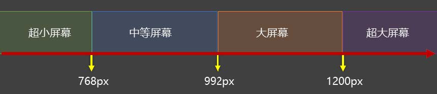
16.4常用阈值 在实际开发中,会将屏幕划分成几个区间,例如:
通配选择器.html
1 2 3 4 5 6 7 8 9 10 11 12 13 14 15 <!DOCTYPE html > <html lang ="zh-CN" > <head > <meta charset ="UTF-8" > <title > 03_媒体查询_运算符</title > <link rel ="stylesheet" href ="./css/index.css" > <link rel ="stylesheet" href ="./css/small.css" > <link rel ="stylesheet" href ="./css/middle.css" > <link rel ="stylesheet" href ="./css/large.css" > <link rel ="stylesheet" media ="screen and (min-width:1200px)" href ="./css/huge.css" > </head > <body > <h1 > 你好啊</h1 > </body > </html >
16.5结合外部样式的用法 用法一:
1 <link rel="stylesheet" media="具体的媒体查询" href="mystylesheet.css">
用法二:
1 2 3 4 5 6 7 @media screen and (max-width : 768px ) { } @media screen and (min-width : 768px ) and (max-width : 1200px ) { }
17.BFC 17.1什么是BFC
W3C 上对 BFC 的定义:
原文:Floats, absolutely positioned elements, block containers (such as inline-blocks, tablecells, and
译文:浮动、绝对定位元素、不是块盒子的块容器(如inline-blocks 、table-cells 和table-captions ),以及overflow 属性的值除visible
MDN 上对 BFC 的描述:
块格式化上下文(Block Formatting Context,BFC) 是Web 页面的可视CSS 渲染的一部分,
更加通俗的描述:
BFC 是 Block Formatting Context (块级格式上下文),可以理解成元素的一个“特异功能”。
该 “特异功能”,在默认的情况下处于关闭状态;当元素满足了某些条件后,该“特异功能”被激活。
所谓激活“特异功能”,专业点说就是:该元素创建了 BFC (又称:开启了 BFC )。
17.2开启了BFC能解决什么问题
元素开启BFC 后,其子元素不会再产生margin 塌陷问题。
元素开启BFC 后,自己不会被其他浮动元素所覆盖。
元素开启BFC 后,就算其子元素浮动,元素自身高度也不会塌陷。
17.3如何开启BFC
根元素
浮动元素
绝对定位、固定定位的元素
行内块元素
表格单元格: table 、thead 、tbody 、tfoot 、th 、td 、tr 、caption
overflow 的值不为 visible 的块元素
伸缩项目
多列容器
column-span 为 all 的元素(即使该元素没有包裹在多列容器中)
display 的值,设置为flow-root
BFC_演示1.html
1 2 3 4 5 6 7 8 9 10 11 12 13 14 15 16 17 18 19 20 21 22 23 24 25 26 27 28 29 30 31 32 33 34 35 36 37 38 39 40 41 42 43 44 45 46 47 48 49 50 51 52 53 54 55 <!DOCTYPE html > <html lang ="zh-CN" > <head > <meta charset ="UTF-8" > <title > 01_BFC_演示1</title > <style > * { margin : 0 ; padding : 0 ; } body { } .outer { width : 400px ; background-color : #888 ; } .inner { width : 100px ; height : 100px ; margin : 20px ; } .inner1 { background-color : orange; } .inner2 { background-color : green; } .inner3 { background-color : deepskyblue; } </style > </head > <body > <div class ="outer" > <div class ="inner inner1" > </div > <div class ="inner inner2" > </div > <div class ="inner inner3" > </div > </div > </body > </html >
BFC_演示2.html
1 2 3 4 5 6 7 8 9 10 11 12 13 14 15 16 17 18 19 20 21 22 23 24 25 26 27 28 29 30 31 32 33 <!DOCTYPE html > <html lang ="zh-CN" > <head > <meta charset ="UTF-8" > <title > 02_BFC_演示2</title > <style > .box { width : 100px ; height : 100px ; } .box1 { background-color : orange; float : left; } .box2 { background-color : green; } </style > </head > <body > <div class ="box box1" > </div > <div class ="box box2" > </div > </body > </html >
BFC_演示3.html
1 2 3 4 5 6 7 8 9 10 11 12 13 14 15 16 17 18 19 20 21 22 23 24 25 26 27 28 29 30 31 32 33 34 35 36 37 38 39 40 <!DOCTYPE html > <html lang ="zh-CN" > <head > <meta charset ="UTF-8" > <title > 03_BFC_演示3</title > <style > .outer { width : 400px ; background-color : #888 ; display : flow-root; } .inner { width : 100px ; height : 100px ; float : left; } .inner1 { background-color : orange; } .inner2 { background-color : green; } </style > </head > <body > <div class ="outer" > <div class ="inner inner1" > </div > <div class ="inner inner2" > </div > </div > </body > </html >